Giving young millennials the confidence to cook meat at home
For many millennials living on their own, the intimidation and “gross” feeling of preparing raw meat stands between them and the experience of cooking on their own. They miss out on the joys of cooking for themselves and their families. They resort to cooking the same bland, easy meals.
Autonome products bring the expertise of professionals to the home cook. The Protein Kit is a curated set of three tools for the touch-free preparation of raw meat.
brand design freelance
My role as a brand design freelancer was to help Autonome develop a color palette and logo for web, print, and packaging. I was provided with their brand values and images of the current product designs.
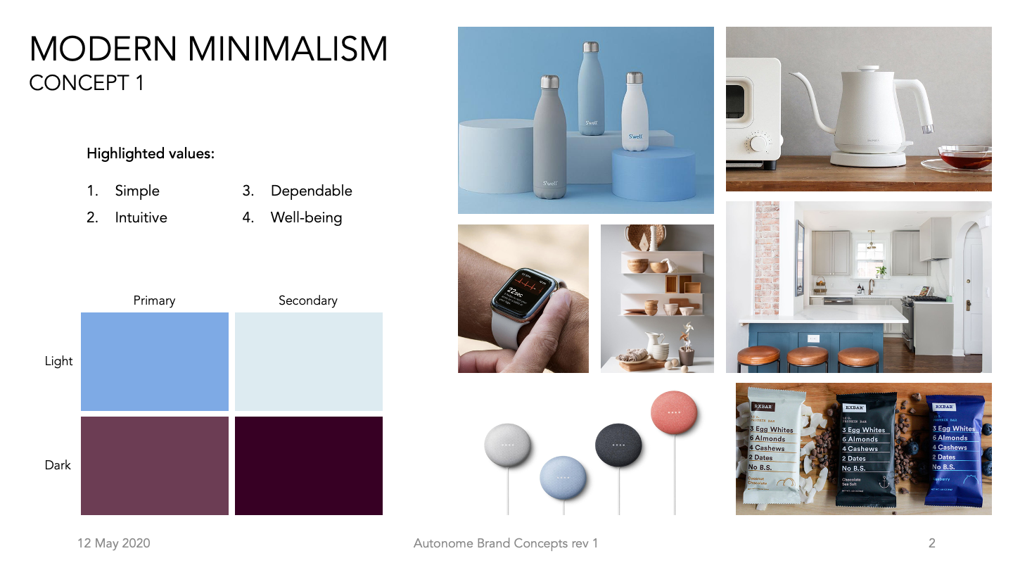
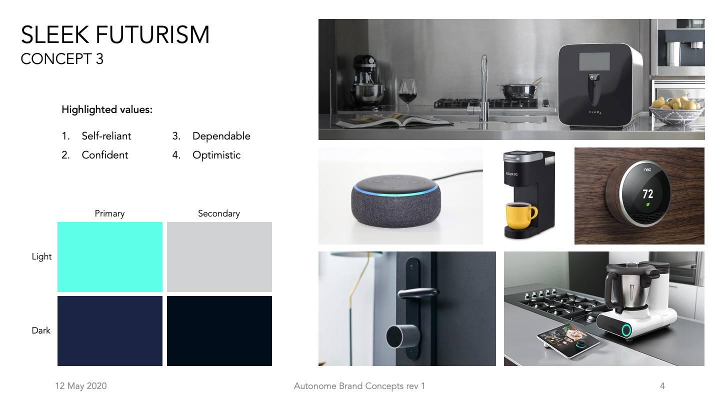
My approach was first creating three design directions based on the brand values. After the Autonome team selected two they wanted to focus on, I developed more detail logo designs that represented a combination of the two,

logo design
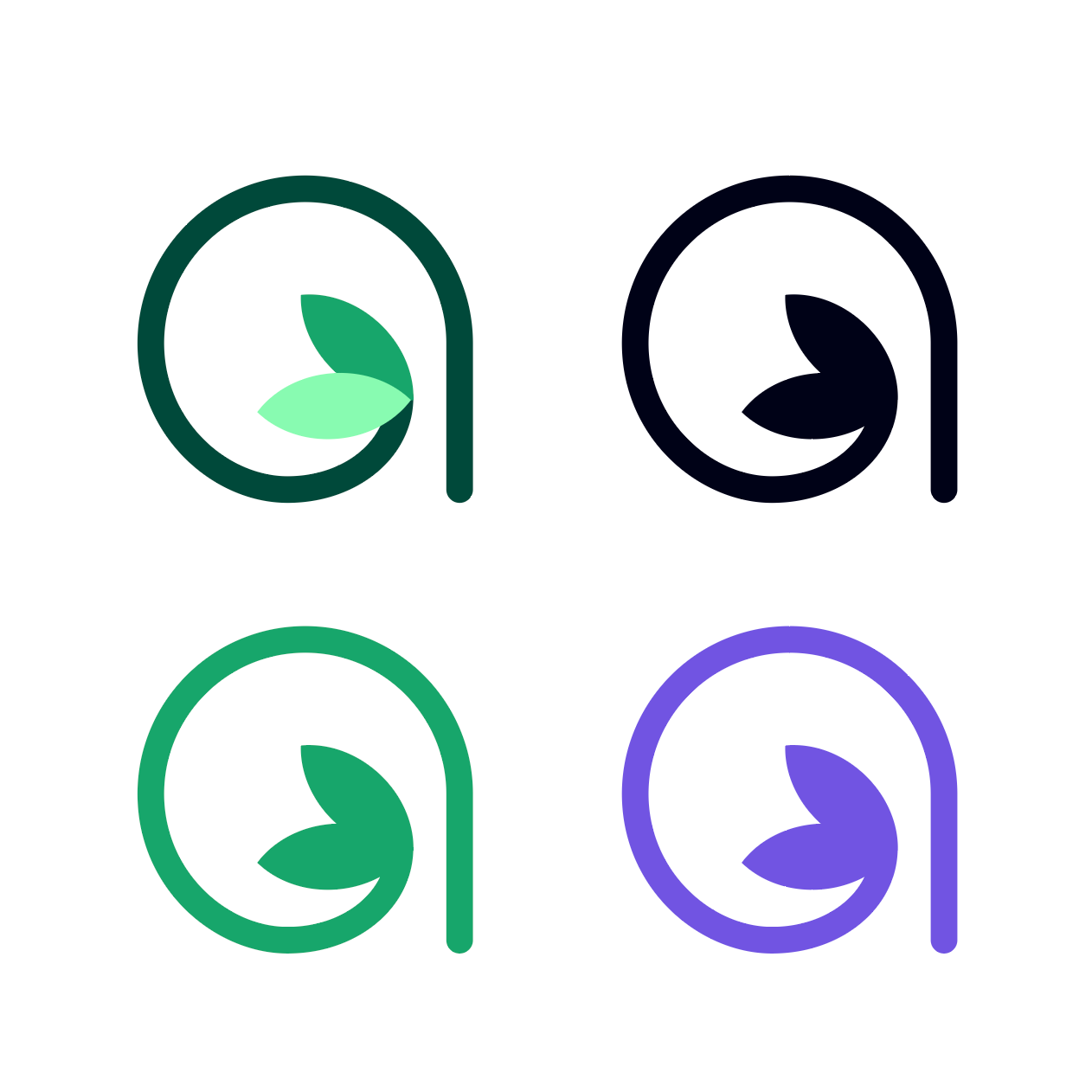
After some market research, I recommended the primary logo to be a simple shape with different colorways optimized for application as a stamp, emboss, or etch on the physical product. The secondary logo (for other web, print, and packaging) could then include both a logotype and logo mark as an expansion of the primary logo.
The logos below explore simple iconography to indicate the industry, a visual guide to the pronunciation of the brand name ("autonomy"), the signature tailfin shape from the Anchor tool, and the use of a sprig of herb to represent both the aspirations of cooking sophisticated food and the intersection of health and sustainability.





final logo
color palette
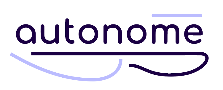
The final color palette is a rooted in two colors: indigo and green. Indigo is a version of royal purple that represents sophistication, independence, and adulthood while the softer green roots the brand in health, wellness, and self-care.
The color tints provide robust combinations for variable usages to ensure both aesthetic design and high contrast for visual accessibility.
